Simple kombucha brand identity and packaging
I value minimalism a lot, but rarely, working with clients, I get to use it to such extent, as with the Simple brand. In this case, it's also in line with the company philosophy, which promotes simple living.
So, the labels are simple, printed just in white and another color on transparent foil. The front features just the name, volume and flavours: presented in text and simple pictures, which I encouraged a brand employee to create, after seeing a sketch of hers in the design brief. The used fonts are, again, simple, pleasant, rounded and devoid of any unnecessary elements.
I have also created the simple website and webstore simplekombucha.pl (featuring our handmade drawings), leaflets and other brand elements.


Jam and juice illustrated labels
The packaging was supposed to communicate natural ingredients and local manufacturing. The client preferred stylized, simplified illustration rather than realism, which resulted in a much pleasing and uncommon type of retro aesthetic.
The illustrations, which I painted, have a cheerful lightness to themselves – they were a pleasure to create. The background is a white wooden cottage wall, and all the texts are in handwritten style fonts, which amplifies the natural feel.


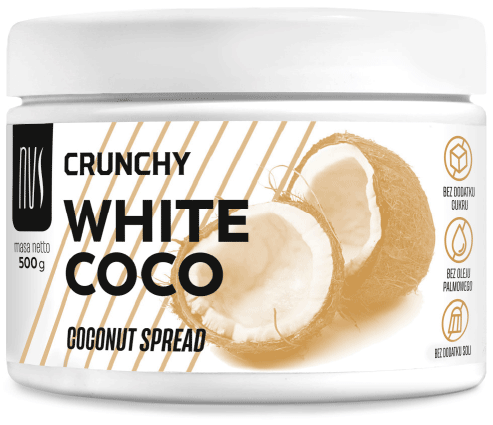
Sugar-free dessert spreads packaging
Usually, I craft illustrations myself, but I decided photography fit the trendy and modern look of these fitness-branch oriented spreads better.
A harmonious limited color scheme and refined typography contribute to a stylish design, while minimalism and dynamic angled stripes address the fitness industry image. The different flavours are easily recognizable thanks to different colours, clear photos and highly readable texts.


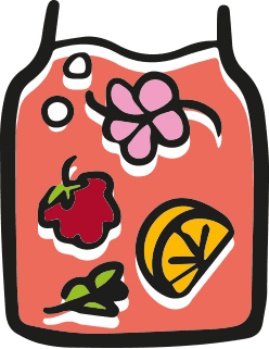
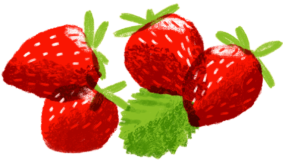
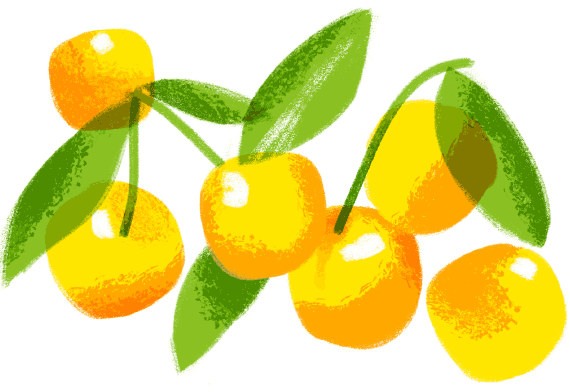
Juice and smoothie label design with fruit and country illustration
This packaging design had to be suitable for printing on transparent foil labels. The design had to fit the underlying various juice colors.
For clear flavors distinction, I have painted very iconic and bold fruit illustrations. They are placed on a memorable drop shape, which represents the HPP technology used in this product. The bottle is encircled by a tranquil rural illustration, symbolizing the natural fresh ingredients. The barcode is illustrated in a similar way.


New vegetable pastes label design
I have designed the packaging of these vegan pastes, hand-painting illustrations of their ingredients in bowls that utilise the packagings' round shapes. The bowls have distinct colors fitting the ingredients.
Each bowl showcases the typographically refined product name and the producer's logo design (also done by me). The whole design emphasizes traditional recipes and natural, fresh ingredients.


Austrian apiary Honey label design
For this apiary I have designed a modern and elegant visual brand identity. After designing the logo and stationery I have designed labels for packaging of 3 types of honey: rapeseed, forest (honeydew) and a blend of both.
Each kind of honey has a different color, ranging from almost white to very dark. I used the three brand colors – white, orange and black – to complement them. Detailed hand-drawn illustrations highlight the products' naturality. They are contrasted with bold product name lettering. Thanks to it and the colors it's hard to miss this minimalistic honey packaging on the shelves.


Muesli bar with fruit label designs
With limited space for a key visual, I have decided on basing the label on bold and vibrant colors of the fruits – whose white silhouettes serve as a backdrop for the products' names. Additional decoration is provided by grain shapes and by leaves in the Marcus Fresh green brand color. The ingredients' organic origin is expressed by using hand-drawn font styles.
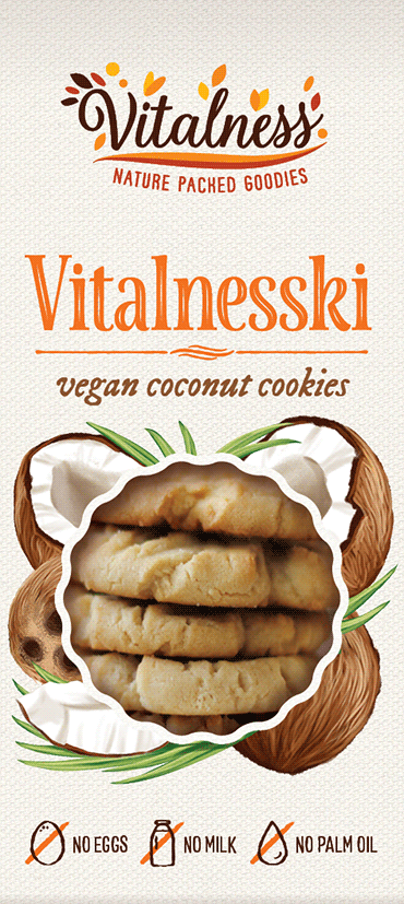


Vegan cookies logo and packaging design
The logo and packaging design (both done by me) was to remind of tradition and nature, be bright and idyllic.
At the center there is a cut-out in the shape of the cookies, surrounded by hand-painted retro-style illustrations depicting the flavors. The lettering is also retro or hand-lettered, while the background is filled with a texture of a bright natural canvas. I have also designed an original illustrated barcode so that the whole packaging is stylish and attractive.


Hummus label designs
For a bakery chain, I have designed packaging for 4 hummus flavors. The design had to be original and fit the style of a modern, hip café-bakery.
I have decorated the labels with a pattern introducing the primary ingredients in a minimalistic aesthetic with simple images of round chickpeas and the main flavor component: dried tomatoes, figs or curry with sumac, set in a distinct color on a blackboard background, typical of café menus.
To emphasize the handmade aspect of the product I picked simple hand-crafted font styles. The same care went into designing the round back panel.
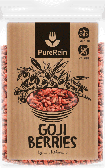


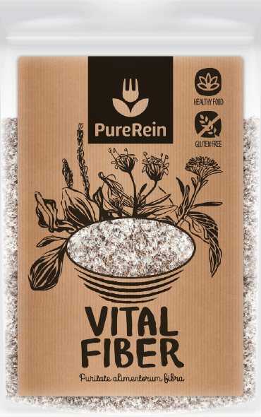
Superfoods brand logo and packaging design
I have started work with the PureRein brand by designing its logo. The founder, impressed with our work, commissioned us with designing the whole packaging line – over 20 products in total.
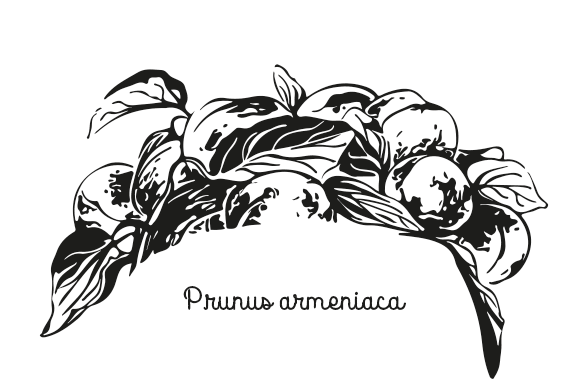
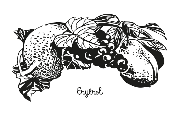
I decided on using hand-drawn illustrations, which was time-consuming, but worth the work and pleasant. The key visual consists of a bowl (encompassing a window with the product's view), above which the plant is pictured. Below I present some of the illustrations.
The label design is printed onto craft paper. The logo design is placed at the top of the label, cut out in a black square. The purpose is for the logo to really stand out as the main element of the packaging so that the shoppers acknowledge the new brand.
The natural look is complimented by hand-made icons and brush-style lettering.


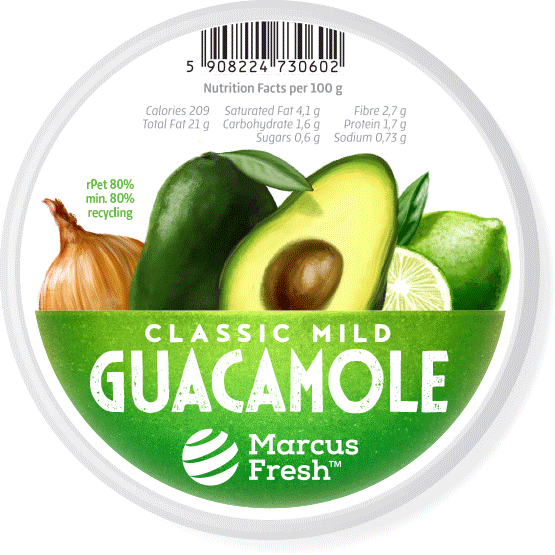
Odświeżenie logo oraz opakowań marki Marcus Fresh
● wzmocniliśmy markę, podkreślając nowe logo – projekt naszego autorstwa
● uczytelniliśmy nazwę produktu ładnym, przyjaznym, nowoczesnym fontem
● uporządkowaliśmy kompozycję, wprowadzając jasną hierarchią (m.in. kod paskowy na margines)
● przerobiliśmy zdjęcia, wyraziście je kadrując i atrakcyjnie retuszując.


Chokeberry products label designs
The packaging design emphasizes the natural (100% certified organic) ingredients of the chokeberry juice, freeze-dried fruits and concentrate. The design utilizes a handmade paper underprint with a subtle chokeberry fruit drawing and elegant sophisticated typography with inline and shadow effects.


Hand sanitizer gel label design
The key visual for this practical everyday use product has a poster-like visual style.
A minimalistic image of dirty and clean hands communicates to the client what is the product's purpose and effect of use. The typography is also simple and clear.
The design was carried out lightning fast, to address the need for this product, as a countermeasure for contracting the COVID-19 virus.
Gasoline generator label design
A simple, utilitarian label design that emphasizes the brand name and device model. The growing circles of the key visual symbolize both energy and fuel. The font used is bold and masculine.

